Every Wallpaper Worry Is Solved with Elizabeth Rees of Chasing Paper

In this episode of the Slow Style Home podcast, I talk with Elizabeth Rees, founder of Chasing Paper. We cover what makes her peel-and-stick wallpaper different, why it’s not just for renters, and how it holds up over time. Elizabeth shares how she built a high-quality, sustainable product that’s easy to use and doesn’t feel temporary or trendy. We also get into how to choose the right pattern, scale, and colorway—plus how to make wallpaper work with artwork, furniture, and older homes that aren’t perfectly straight. If you’ve ever been curious about wallpaper but felt overwhelmed or unsure where to start, this one’s for you.
Watch this entire episode on YouTube HERE
KEY TAKEAWAYS
Rethinking Peel-and-Stick Wallpaper
If the phrase “peel-and-stick wallpaper” makes you think of shiny plastic and bad dorm room decisions, you're not alone. That’s exactly what Elizabeth found when she first looked into it. At the time, most options were poorly designed, low quality, and hard to remove.
What she created instead is a fabric-based peel-and-stick wallpaper with texture, a matte finish, and just the right amount of adhesive: strong enough to stay up for years, but removable without damaging your walls.
“It’s like a giant post-it note,” she said. “People aren’t afraid of post-it notes.”
And it’s not just for walls. People have used Chasing Paper to cover desks, bookshelves, kitchen cabinets, even refrigerators. It’s a material that invites creativity without a huge commitment, ideal for small spaces, first-timers, or anyone who just wants to try something new.
Why Renters (and Homeowners) Love It
Chasing Paper started with renters in mind. Elizabeth was living in a 250-square-foot apartment in New York City and wanted a way to make her space feel personal. She wasn’t allowed to paint, so traditional wallpaper was out of the question.
That’s why peel-and-stick made sense—and not just because it’s removable. The format itself makes a difference: Chasing Paper uses panels, not rolls, which are easier to handle in tight spaces. No long strips to wrestle with. You don’t even need a second person to install it.
But what started as a renter-friendly product quickly gained traction with homeowners, too—especially those who want to test a bold pattern before committing. Even professional wallpaper installers like it for its simplicity and precision.
Making Wallpaper More Sustainable
Wallpaper and sustainability don’t always go hand in hand. But Elizabeth has made it part of Chasing Paper’s mission to do things differently. That starts with the materials:
Paper sourced from responsibly managed forests
Some materials include up to 15% recycled content
Inks are VOC-free and odorless, which makes them safe for nurseries and kids’ rooms
UV-cured inks for durability, so you don’t have to replace them anytime soon
Even the format plays a role. Using panels instead of long rolls reduces waste, especially for patterns with large repeats. You only order what you need, and you’re not left with excess that ends up in the trash.
And perhaps most importantly, the product is made to last, even if it’s peel-and-stick. Elizabeth has heard from customers who’ve moved and taken their wallpaper with them, resticking it in their new homes.
Pattern, Scale, and Density: What You Need to Know
Choosing the right wallpaper can feel overwhelming. There are so many options, and it's not always easy to imagine how something that looks good on a sample will feel in a full room. Elizabeth broke it down into simple, practical terms:
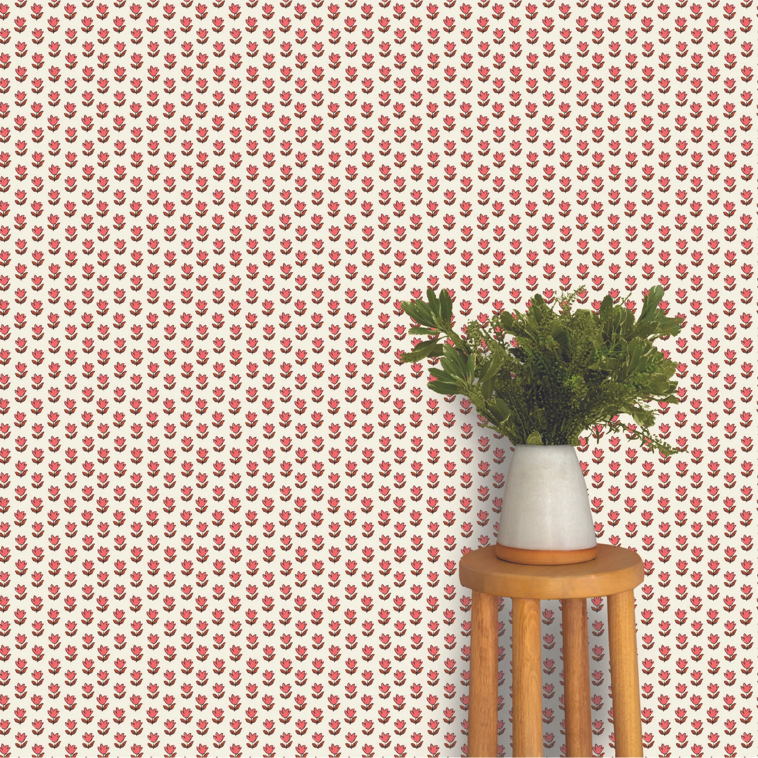
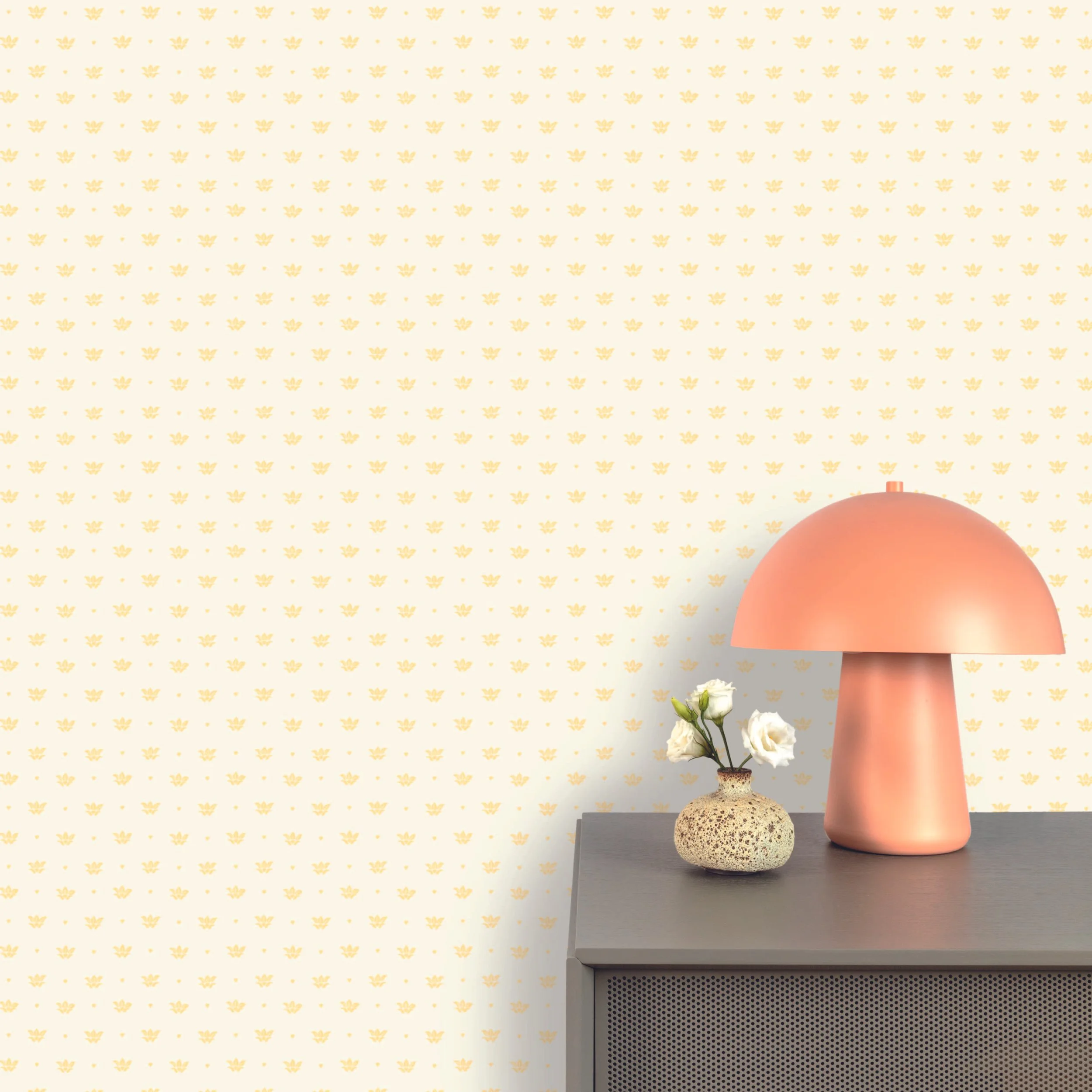
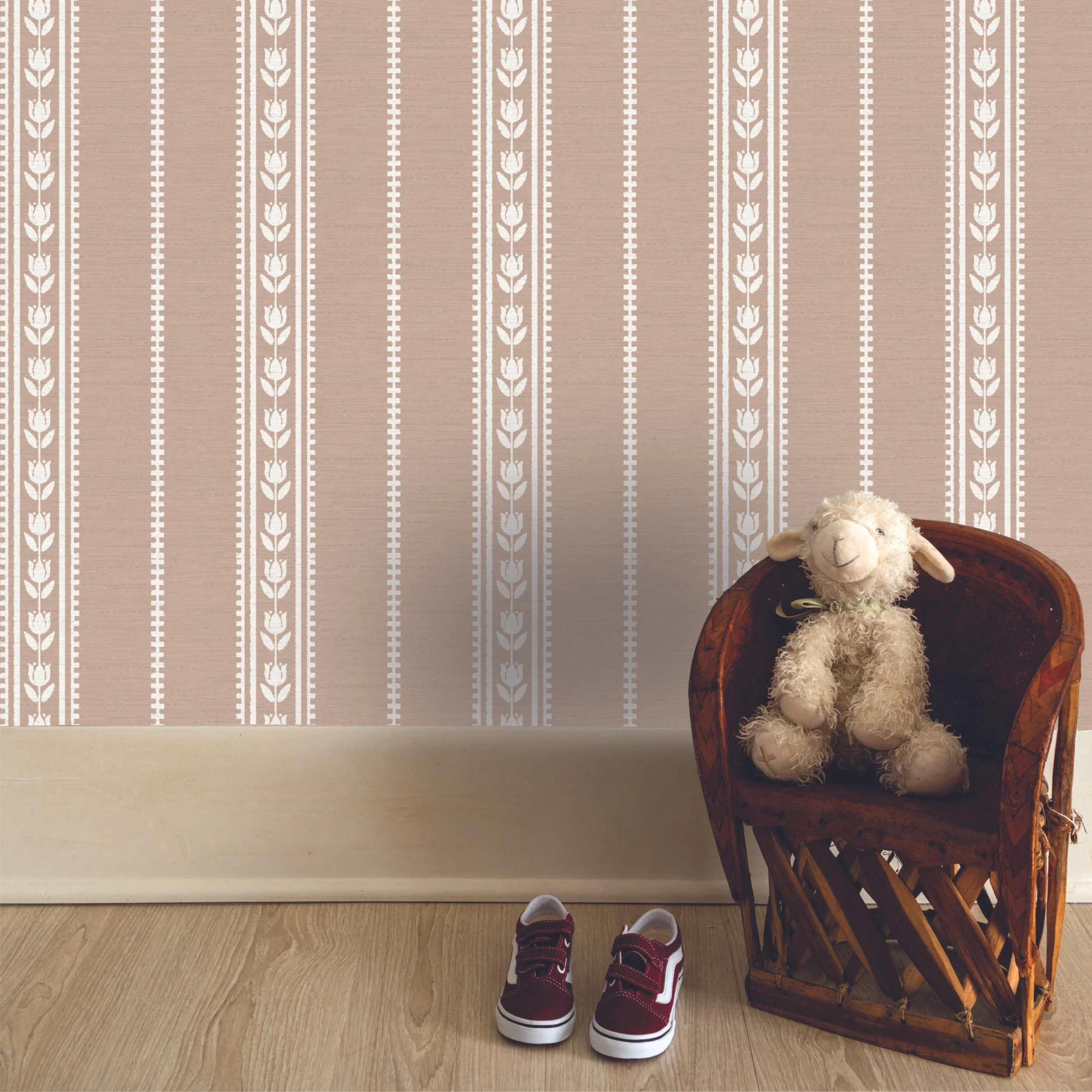
Scale
Small-scale patterns read like texture from a distance. They’re subtle, and they work well with artwork or layered decor. Great for entryways, reading nooks, or any space where you don’t want the wallpaper to dominate.
Medium-scale patterns are the most popular. They strike a balance—enough impact without taking over a room. This is the safe middle ground for most spaces.
Large-scale patterns can feel dramatic, but they actually work well in small spaces too. Think powder rooms or reading nooks. When you only see one full repeat, it almost reads like a mural.
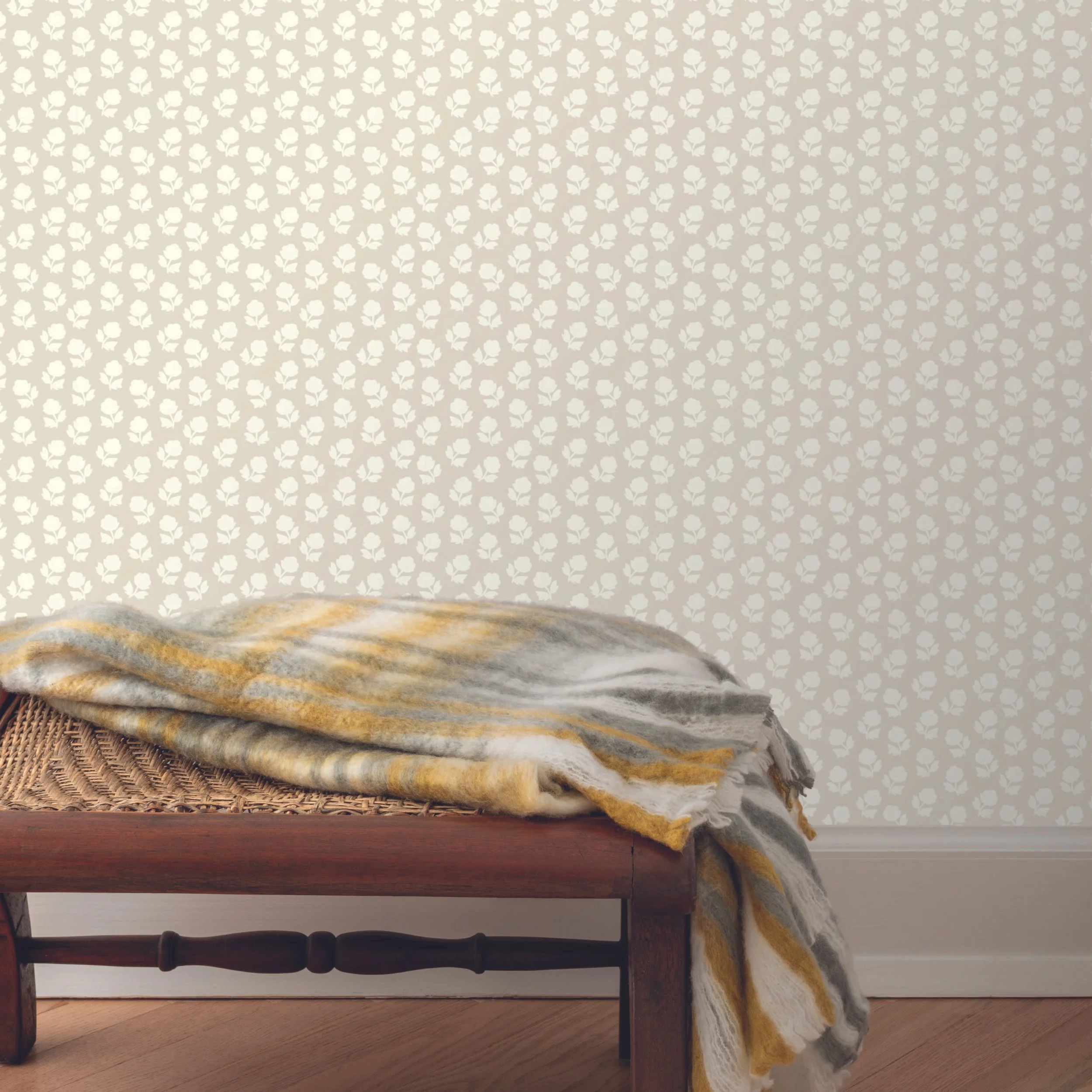
Density
Elizabeth also talked about pattern density, or how tightly packed the elements of the pattern are.
Sparse designs give more breathing room and work well with traditional or minimal furniture.
Dense designs add energy, especially when paired with clean-lined furniture or modern art.
Dense neutrals are underrated. Just because something is beige or taupe doesn’t mean it has to be boring.
“A small-scale neutral can be the X factor in a room,” she said. “It adds warmth and texture without stealing the show.”
When the Walls Aren’t Straight
This one hit close to home for me—literally. In old houses, nothing is level. So I asked Elizabeth how to handle linear or striped wallpaper in a crooked room.
Her advice: make it look right to the eye, not the level. She recently had this exact issue in her own bathroom. The wallpaper was perfectly straight, but the ceiling wasn’t, and it looked off. So she adjusted it slightly to make it feel right visually.
This is where hand-drawn, organic patterns can be helpful. They’re more forgiving. With softer lines and natural variation, you’re less likely to notice small imperfections.
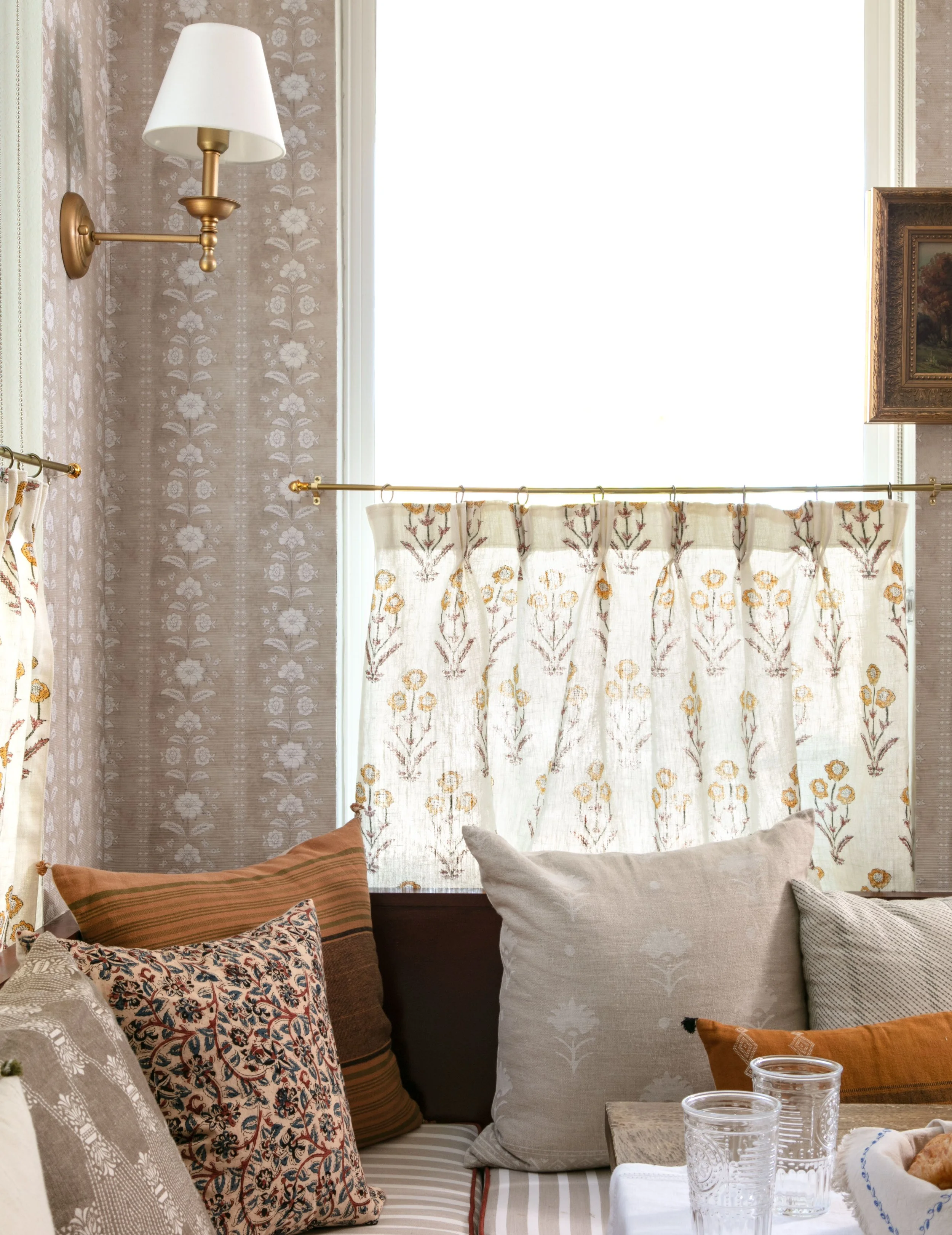
Mixing Wallpaper with Art and Objects
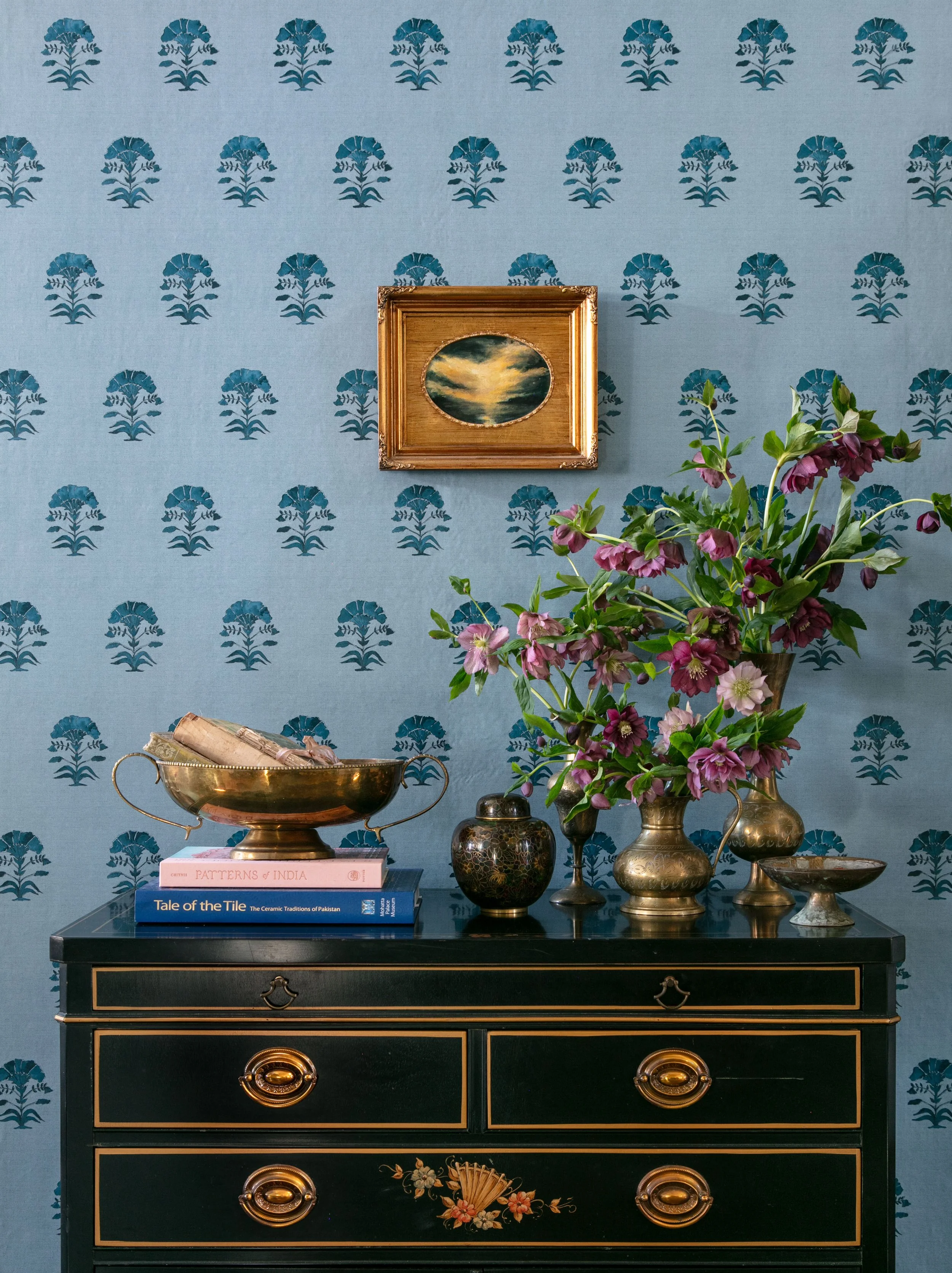
We talked a lot about layering wallpaper with furniture, artwork, and other objects, because that’s where real personality comes in. Elizabeth had a few great examples:
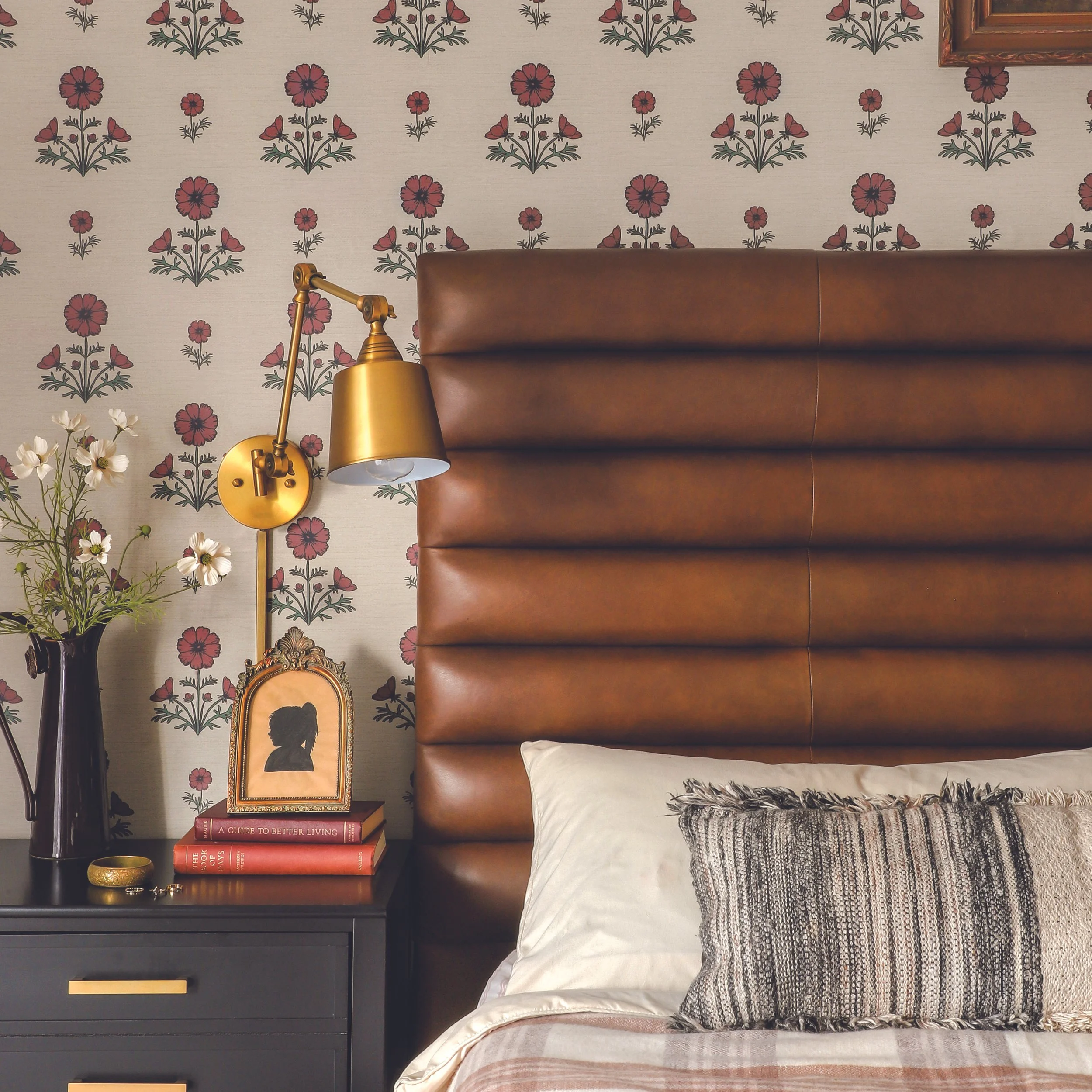
A traditional toile wallpaper paired with a tiny oil painting gave the space a sense of history and warmth.
A bold floral wallpaper echoed the colors of the artwork layered over it, tying everything together.
In one room, wallpaper on the ceiling (!) added surprise and depth, while the walls featured a denser, block-printed pattern.
The key isn’t matching everything—it’s letting contrast create interest. Classic wallpaper with modern furniture. Clean lines with hand-painted patterns.
“That’s where the magic happens,” Elizabeth said. “When you mix eras and styles and make it your own.”
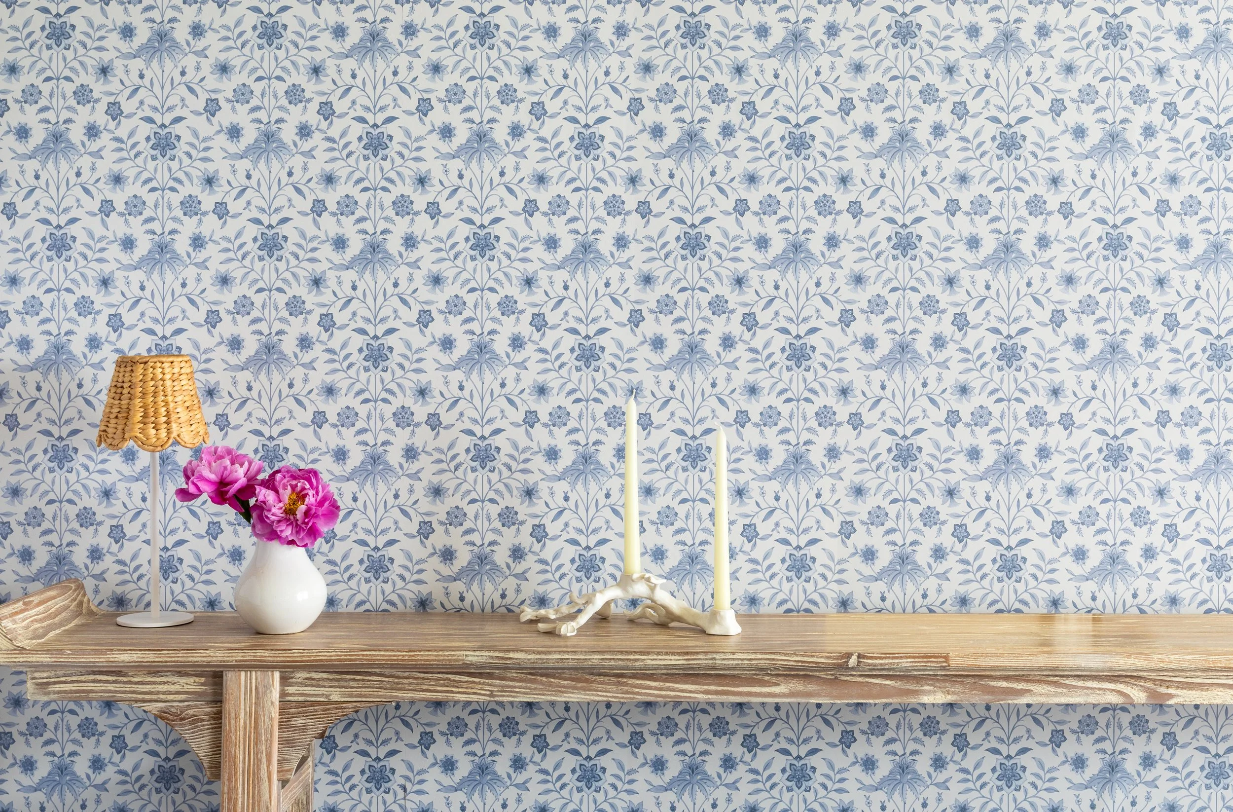
Colorways Change Everything
One of the most useful tips from our conversation was to always check all the colorways. You might hate a pattern in blush pink and absolutely love it in deep brown.
Elizabeth showed examples of how the same jungle toile print looked playful in pink (great for a kid’s room) and moody in brown (perfect for a study or mudroom). Same pattern, completely different mood.
Color can take something from cottagecore to modern, from soft to dramatic. Don’t skip this step.
Elizabeth Rees isn’t just selling wallpaper—she’s making it approachable. Peel-and-stick used to mean “temporary” or “cheap.” She’s turned it into something intentional, flexible, and high-quality.
Whether you rent or own, whether you're into bold color or subtle neutrals, Chasing Paper gives you room to experiment, layer, and learn what works for you. And when something helps you express who you are, without creating waste or forcing a big commitment, that’s a win.
It’s not just about wallpaper. It’s about how you want to feel in your home.
Until Next Time!
-Zandra
Links Mentioned In Episode
Chasing Paper’s Website
Chasing Paper’s Instagram