A Mix of Texture Rather Than Color: How To Flow From Room To Room With Hill Rondero

In this episode of the Designers at Home series, I had the pleasure of visiting the home of Charlotte-based interior designer Hill Rondero. I first met Hill when she moderated a design talk I gave at Slate Interiors, and I immediately knew I wanted to see her home. It’s a great example of what a cohesive house can look like. Nothing in the space is trying to be the star; instead, everything works together. It was the conversation happening between everything: the vintage French pieces next to mid-century chrome, the tattered leathers beside rattan, the quiet discipline of a neutral palette layered with texture after texture. Hill proves that when you let materials, art, and collected objects do the talking, color almost becomes secondary. Her home feels calm but never boring, thoughtful but never precious—and along the way we talk about risk-taking in design, why texture palettes matter just as much as color palettes, and how the things you’re most afraid to try are often the very things that make a space unforgettable.
KEY TAKEAWAYS
In this episode of the Designers at Home series, I had the pleasure of visiting the home of Charlotte-based interior designer Hill Rondero. I first met Hill when she moderated a design talk I gave at Slate Interiors, and I immediately knew I wanted to see her home. She has such a thoughtful approach to design, and as it turns out, her house is the perfect expression of that philosophy.
Hill’s home is a great example of what a cohesive house can look like. Nothing is overly styled or trying too hard to stand out. Instead, every room feels connected through materials, textures, and carefully chosen pieces that work together.
A Neighborhood That Feels Like a Retreat
Hill and her family moved into this house about three years ago. The neighborhood is made up of 1950s ranch homes and sits just outside the city. For Hill’s family, the move felt like a big shift, even though it was only a couple of miles away.
But the setting was a big part of the appeal. There’s a small lake across the street, deer wander through the yard in the mornings, and the single-level layout offered great livability. Her youngest child even learned how to fish at the lake after they moved in.
When I arrived, I knew I had found the right house the moment I spotted disco balls hanging near the pool.
An Entryway That Sets the Tone
Hill believes entrances matter. She sees them as the place where you introduce guests to the personality of the home.
In her entryway, a vintage kilim rug sits under a simple chair and antique table topped with a fern. Nearby, an antique hutch adds depth and character. Nothing feels overly formal, but the mix of vintage furniture, art, and texture immediately gives you a sense of what’s coming next.
Hill loves juxtaposition in design. She often pairs something like a vintage French piece with mid-century chrome and leather. The contrast allows each item to stand out rather than blending into a single stylistic category.
A Calm Color Palette with Lots of Texture
One of the first things you notice is Hill’s disciplined color palette. The home leans heavily into neutrals—woods, blacks, whites, creams, and tans.
Hill explained that she keeps the house calm because she herself is naturally high-energy. She prefers her home to feel like a peaceful backdrop. Instead of relying on bold colors, she layers in texture through rugs, materials, plants, and art.
Greenery also plays a big role. Plants appear throughout the house, bringing color and life into the neutral environment. As Hill puts it, the house acts as a canvas while the life happening inside it becomes the color.
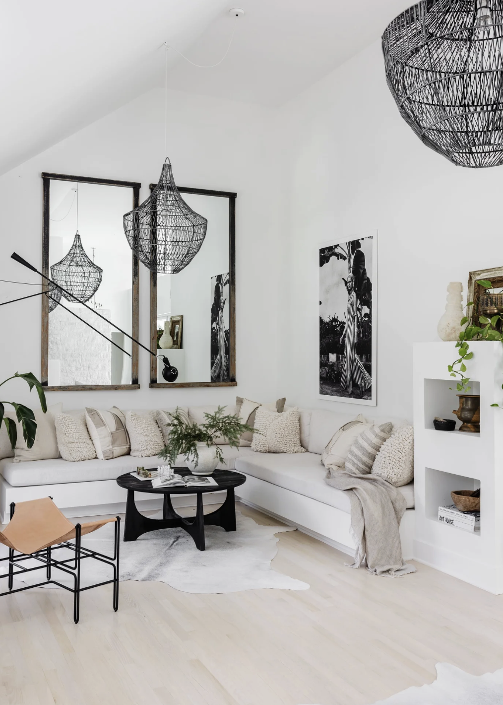
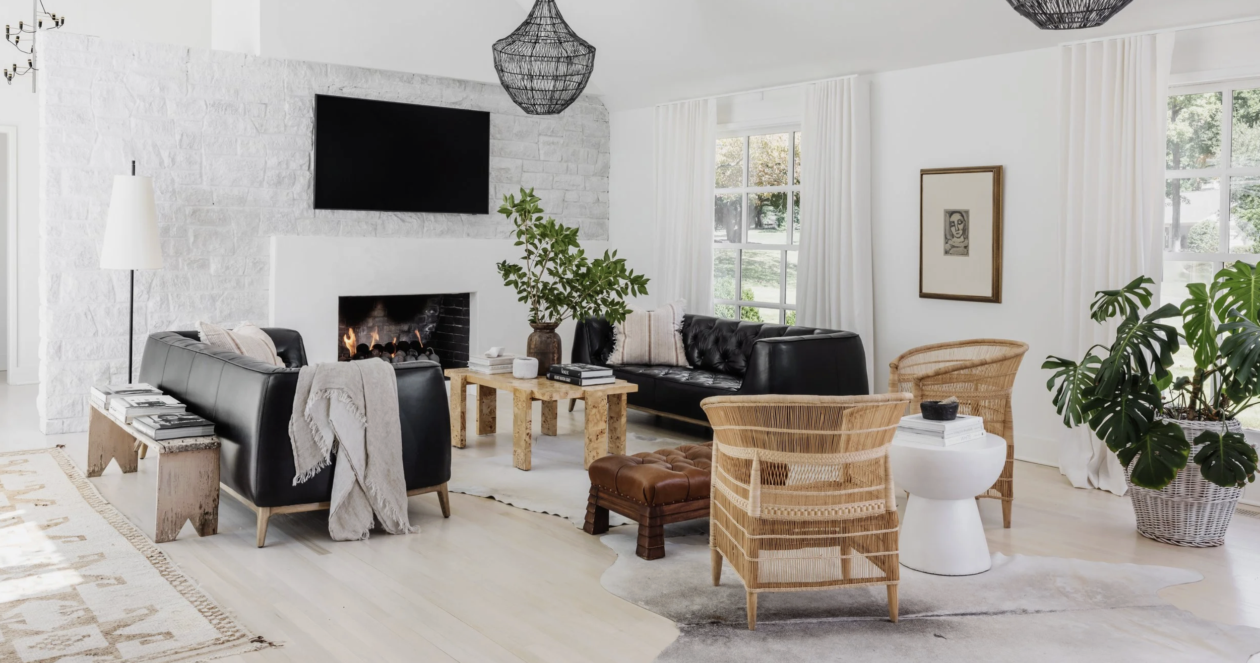
Two Living Areas That Work Together
The main living space is open but thoughtfully divided into two distinct seating areas.
One section centers around a fireplace with painted stone and a black firebox. Facing each other are two tufted black leather sofas from the 1950s. Between them sits a burlwood coffee table and a worn leather footstool. A cream high-pile rug and sheepskin layer in softness, while rattan chairs sit perpendicular to the sofas.
Across the space, a built-in banquette creates another seating zone. Nearby, a sculptural bust sits on a wooden plinth, paired with a mushroom-shaped lamp. A large monstera plant acts as a natural divider between the two areas.
The room is full of interesting combinations—vintage leather next to rattan, French-style shapes beside more modern sculptural furniture—but the limited color palette ties it all together.
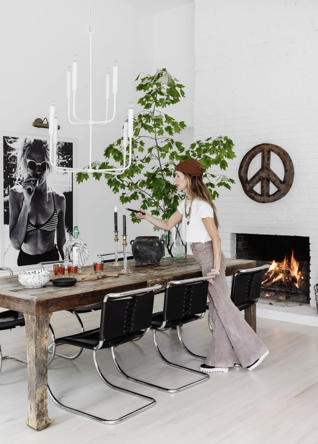
Taking Risks with Art
Hill collects art and uses it throughout the house, often in unexpected places. One large black-and-white photograph in the kitchen area shows a woman in a bikini top smoking a cigarette.
The image originally appeared in a show house Hill designed early in her independent career. At the time, she was nervous about displaying something provocative in the South. But the room—and the photograph—were incredibly well received.
That experience gave her confidence to keep pushing boundaries in her work. Now she encourages clients to take similar risks, especially with scale.
Her advice is simple: the thing you’re most unsure about often becomes your favorite.
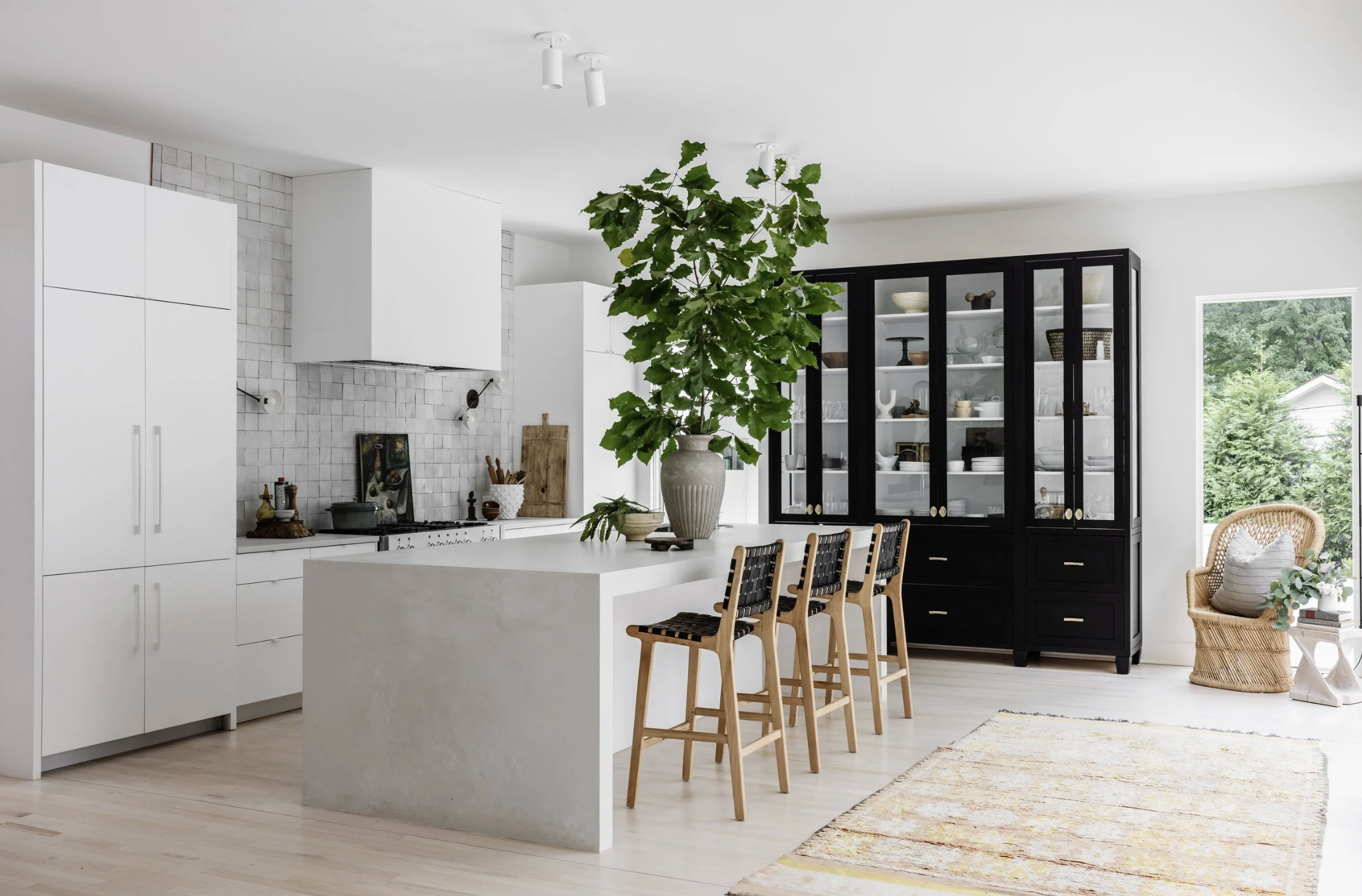
A Kitchen Addition That Feels Original
The kitchen is part of an addition to the original house. The goal was to add space while making it feel like it had always been there.
Large windows bring in views of the pool and greenery outside, while the layout still maintains distinct zones rather than one giant open room.
The island is made from quartz by Caesarstone in a finish called “Cloud Cover.” It has a soft, concrete-like look with subtle texture. Hill intentionally chose quartz instead of marble—something she normally loves—because she wanted a more durable surface for cooking.
She even offset the sink toward one side of the island so she could place large floral arrangements in the center without obstruction.
One Bold Cabinet Makes the Kitchen Work
One of the defining features of the kitchen is a large black cabinet that stands out against the otherwise light palette.
Hill realized the kitchen needed a strong visual anchor, and this cabinet provided it. Inside, everyday dishes and objects are displayed alongside small pieces of art tucked throughout the shelves.
The effect feels collected over time rather than styled all at once.
Softening the Modern Elements
While the kitchen includes modern features like a waterfall island, Hill softened the space with unexpected touches.
One of my favorite details is a café curtain tucked under the island. It adds a slightly romantic feeling to an otherwise sleek surface and hides everyday items that the family uses regularly.
Nearby, zellige tile with lots of movement adds texture to the walls. The tiles were intentionally left ungrouted to emphasize their handmade quality.
Lighting is also subtle—movable wall sconces provide a soft glow rather than strong overhead light.
A Bar with a DIY Art Collage
One small bar area has one of the most creative design solutions in the house.
Hill spent over a year trying to decide on a backsplash. She considered wallpaper and even ordered samples, but nothing felt right.
Eventually, she started tearing images from fashion books and magazines she loved. She arranged them into a collage that now acts as a one-of-a-kind backsplash.
The collage adds personality and works perfectly for a space meant for gathering and conversation.
Why Cozy Spaces Matter
Next to the bar is a small built-in dining nook.
Hill says spaces like this always end up being the most popular areas of a house. She learned this in a previous home where her family of five would squeeze into a tiny built-in bench near the fireplace.
People naturally gravitate toward cozy spaces. Even in large homes, a tight seating area often becomes the place where everyone gathers.
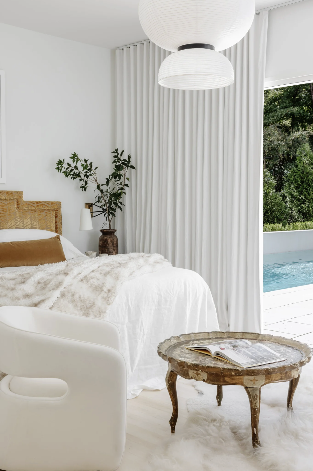
A Private Primary Suite
The primary bedroom is part of the home’s addition and sits slightly lower than the rest of the house. The step-down transition creates a subtle shift from public spaces to private ones.
The design also allowed the bedroom to sit level with the pool deck outside. Sliding glass doors open directly to the patio, where a waterfall feature provides the sound of moving water throughout the space.
Inside, the room is intentionally simple. A vintage headboard—custom made about 15 years ago—anchors the bed. Two upholstered chairs sit at the foot, creating a small sitting area.
Many pieces have traveled with Hill from previous homes, including a French-style side table and several pieces of artwork.
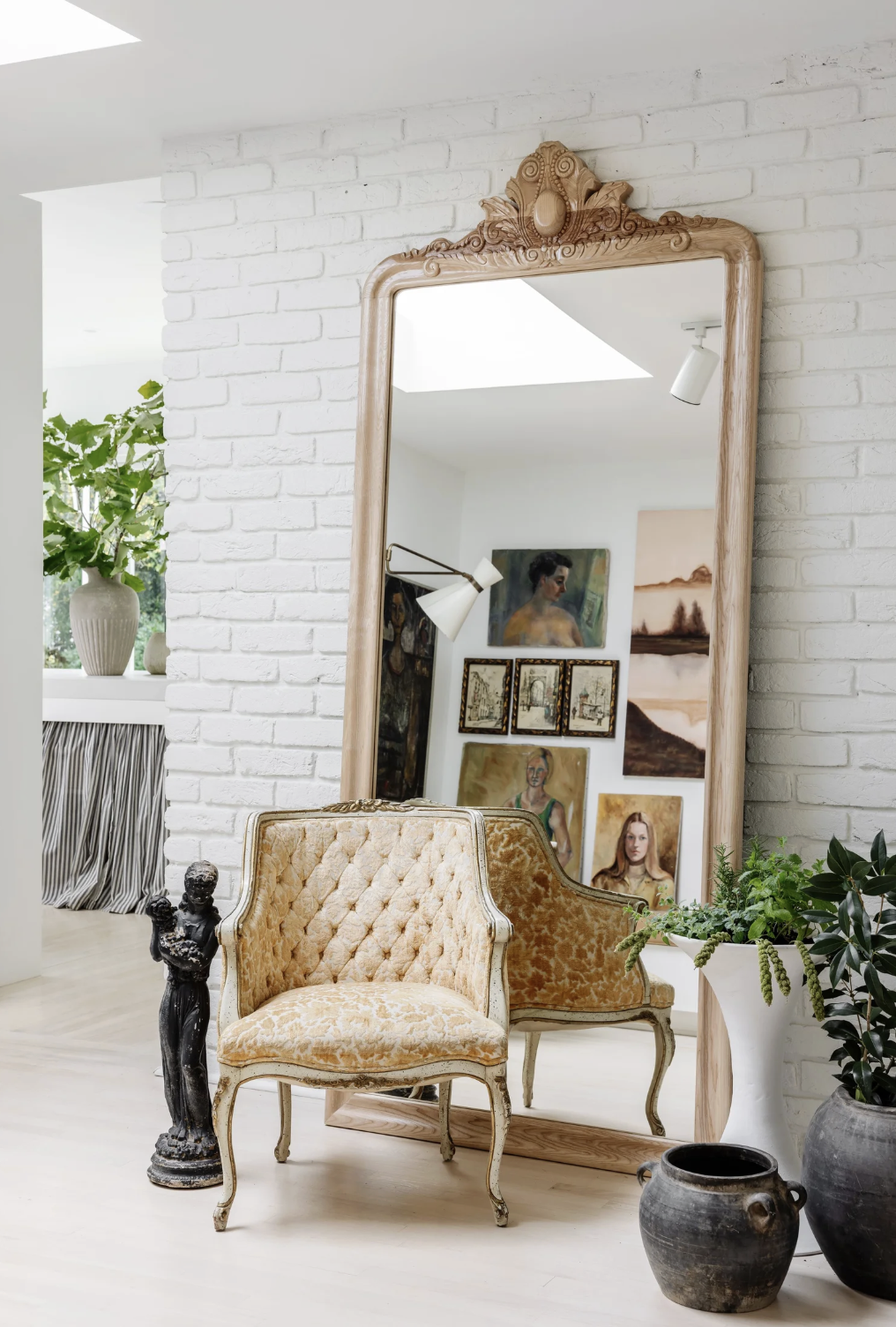
Small Moments That Draw You In
Throughout the home, Hill creates little visual destinations. A sculptural urn placed on a cloverleaf table at the end of the bathroom creates a focal point that draws you deeper into the space.
Branches gathered from outside are often used as simple arrangements. Hill loves their sculptural shapes and doesn’t feel the need to always use fresh flowers.
These moments appear all over the house and help guide the eye from room to room.
A Home Built Through Experimentation
One of the most refreshing parts of touring Hill’s home is hearing how many things didn’t come together immediately.
She tried wallpaper that didn’t work. She rearranged art multiple times. She experimented with different ideas until something clicked.
Even professional designers figure things out through trial and error.
And that might be the biggest takeaway from this episode: creating a home you love doesn’t happen instantly. It happens by living with things, experimenting, and slowly building a collection that reflects who you are.
Until Next Time
-Zandra
Links Mentioned In The Episode
Hill’s Website
Hill’s Instagram