Slow Style In The Wild: Christina Cruz Leans on Art, Nature and Antiques
In this episode of Think Like a Designer, I sit down with Christina Cruz to talk about what slow style really looks like in action. Her aesthetic may be more modern and pared back than mine, but it’s just as layered and soulful. We explore how she blends antiques with clean lines, incorporates meaningful travel finds, and uses natural materials to warm up contemporary spaces. From gallery walls built around collected art to a moody office-turned-bar and family-friendly kitchens that don’t sacrifice beauty, Christina proves that great design isn’t about trends—it’s about intention. Different look, same philosophy: create a home that tells your story.
KEY TAKEAWAYS
In this episode of the Think Like a Designer series, I sat down with Houston-based designer Christina Cruz—someone who so naturally embodies slow style principles, even if she doesn’t call them that. What I love most is that while our aesthetics are quite different, our philosophy is the same: rooms should feel layered, storied, and deeply personal.
Where my spaces lean colorful and maximal, Christina’s are more disciplined in palette—modern at first glance—but filled with patina, antiques, and organic warmth once you look closer.
A Modern Aesthetic, Rooted in Story
Christina describes her style as modern with clean lines—but always grounded by organic elements. Natural stone. Lived-in furniture. Vintage pieces with wear and tear. She lights up when she talks about patina.
One of my favorite things she said was that every object in her home has a story—even a chipped vase her son made. You might not see the crack at first glance, but she knows it’s there. That’s slow style. That’s emotional layering.
And this layering shows up everywhere in her work.
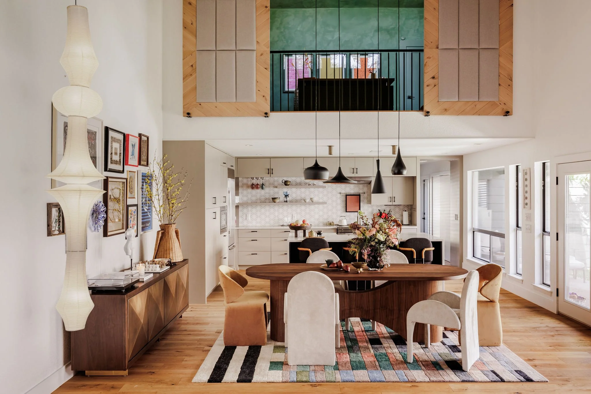
Designing for a Well-Traveled Life
One of Christina’s client projects centered around a young couple who surprise each other each year with mystery trips. They pack each other’s bags, show up at the airport, and discover their destination at the gate. (Isn’t that romantic?)
They return from these trips with art and objects that matter to them—and Christina designed the home around those treasures.
Two Hermès scarves from Paris were framed and illuminated with picture lights.
Shelving was backed in wallpaper reminiscent of African mud cloth.
Moroccan accents and a red-and-beige raffia lamp tied the palette together.
A giant gallery wall showcased art collected from around the world.
A sculptural paper lantern anchored the double-height entertainment space beneath 18–20 foot ceilings.
What I loved was how intentional it all felt. The open-concept layout moved seamlessly from living to dining to kitchen, but each area had emotional weight because it was grounded in their story.
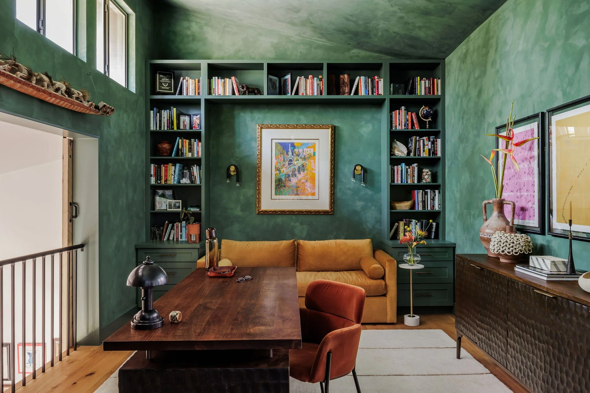
The Emerald Green Flex Space
Upstairs, Christina created a lime-washed emerald green flex room using Color Atelier’s shade “Ritual.” The space functions as both an office and a guest room.
She installed a custom bookshelf that spans an entire wall and tucked an ochre sleeper sofa into the center. And let me tell you—emerald green and ochre together are magic.
The lime wash creates movement and depth, while terracotta vessels, sculptural sconces, and velvet upholstery bring texture. When the sofa opens, it becomes a guest room. Form and function working beautifully together.
Rethinking the Dining Room
In another project, Christina faced a common challenge: an open floor plan where the dining table sat directly in the pathway from the front door. Instead of accepting the awkward flow, she reimagined the layout.
She recessed a built-in banquette into a long wall, pushing the table out of the traffic line and creating what feels like a private dining nook—almost like reserving a table in a restaurant.
Meanwhile, the kitchen features a split-level island:
Counter height near the range
A drop-down table-height section for young children
Because the cooktop couldn’t be moved, lowering one section kept little hands safely away from the stove. Practical and thoughtful—without sacrificing aesthetics.
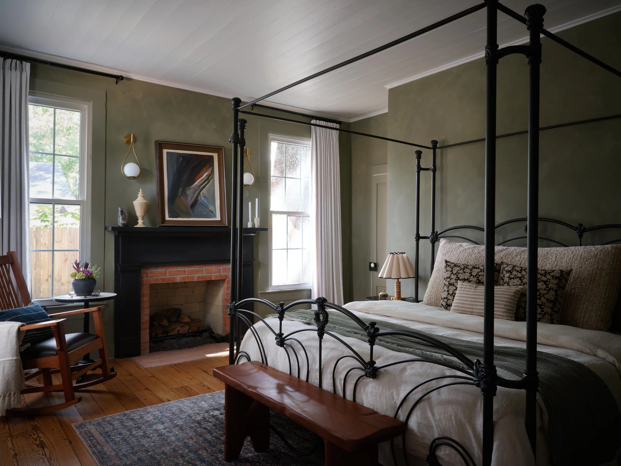
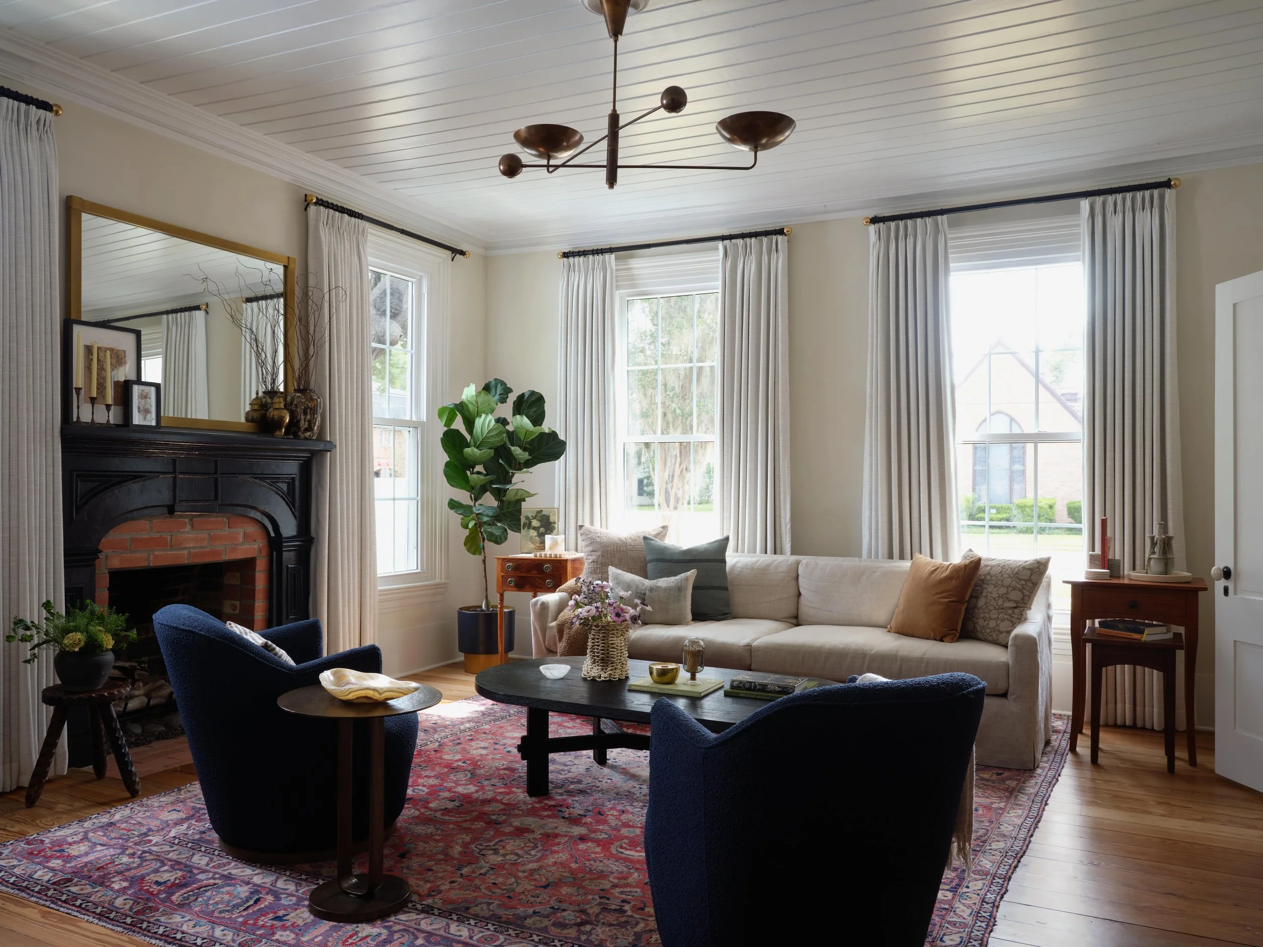
Honoring History in an 1851 Home
One of my favorite transformations was a historic home built in 1851 in Columbus, Texas.
Rather than strip away its character, Christina celebrated it:
Original thin tongue-and-groove ceilings
Original hardwood floors
A red brick fireplace
A vintage iron four-poster bed passed down in the family
The husband, a woodworker, had made a bench and rocking chair years earlier—non-negotiables in the design. Christina layered in lime-washed sage walls, painted the mantel in Tricorn Black, and added modern battery-operated sconces (a genius solution when adding wiring wasn’t possible).
Seventy percent of the furnishings were new—but peppered with Danish vintage stools, Belgian pottery, and a Persian rug. The mix softened modern silhouettes while honoring the home’s roots.
That balance between old and new? That’s where magic lives.
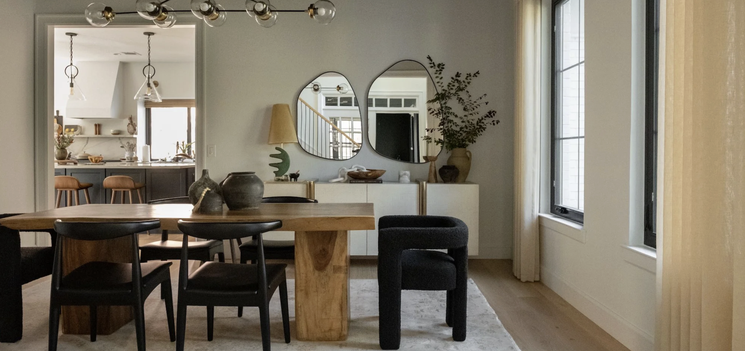
Christina’s Own Home: Organic Shapes & Natural Materials
When we shifted into Christina’s personal home, the through-line became even clearer.
In her dining room:
A live-edge teak table she and her husband bought 18 years ago
Organic-shaped mirrors instead of traditional rounds
A vintage Spanish lamp with a sculptural form
Wishbone-inspired chairs with soft curves
Sheer linen drapery to soften the visual weight
The palette is restrained—black, wood, linen—but the shapes are fluid and calming. Nothing juts upward aggressively; the chair backs stay low, allowing clear sight lines into the kitchen. It feels grounded but not heavy.
And she’s already planning to evolve the space with a green marble table and full color drenching. I love that she allows her home to grow with her.
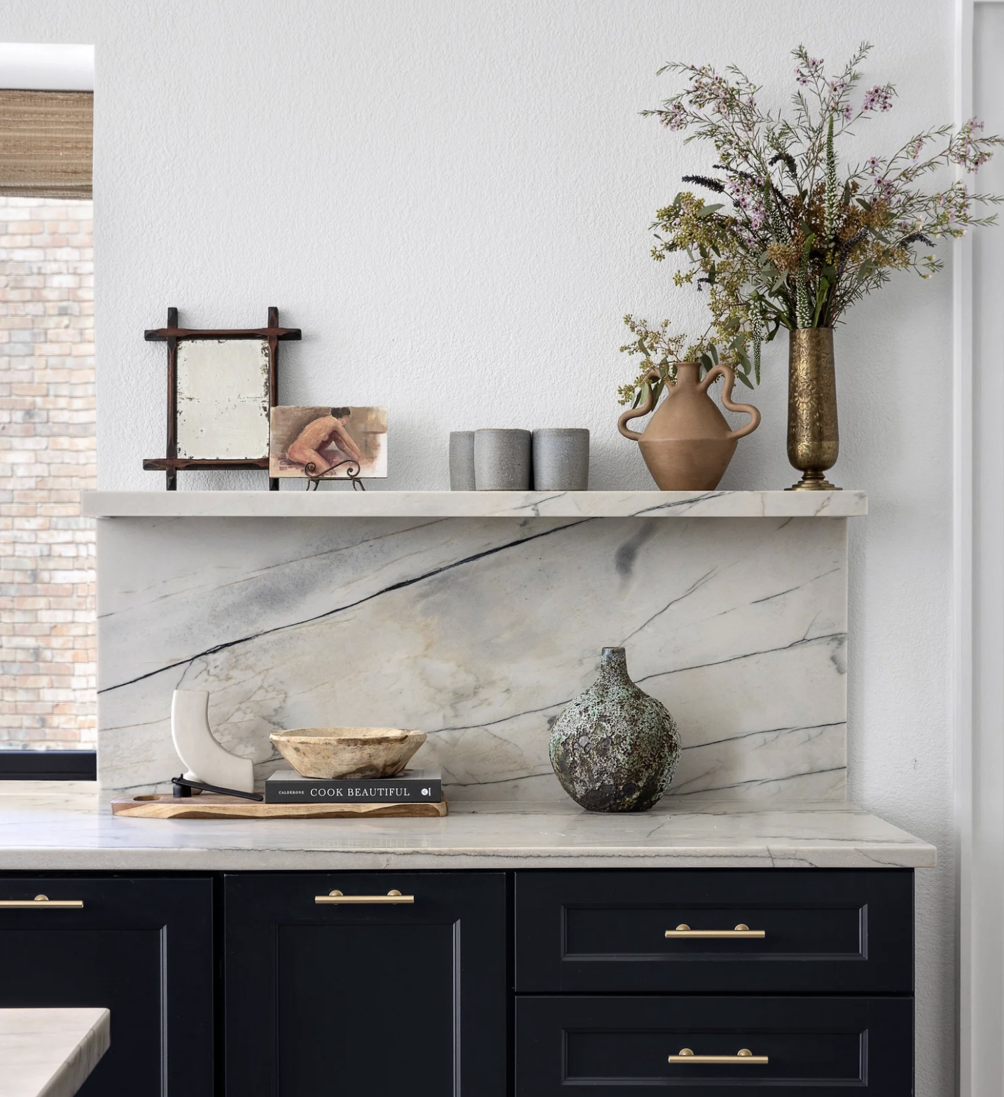
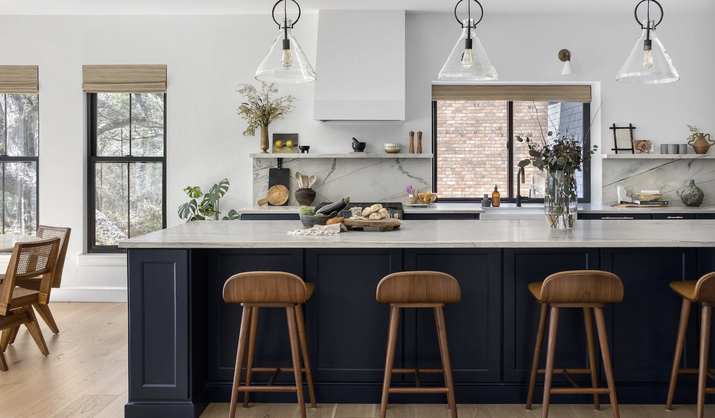
A Kitchen Without Uppers
In her kitchen, Christina opted for a 12-foot quartzite island and no upper cabinets.
Instead:
Deep drawers provide storage.
A rotating display shelf above the backsplash showcases art and vessels.
Vintage crocks and breadboards hold everyday tools—no mass-produced “Utensils” containers here.
She talks about “romanticizing” the everyday. Using beautiful objects for daily rituals. Elevating the ordinary.
That’s slow style in its purest form.
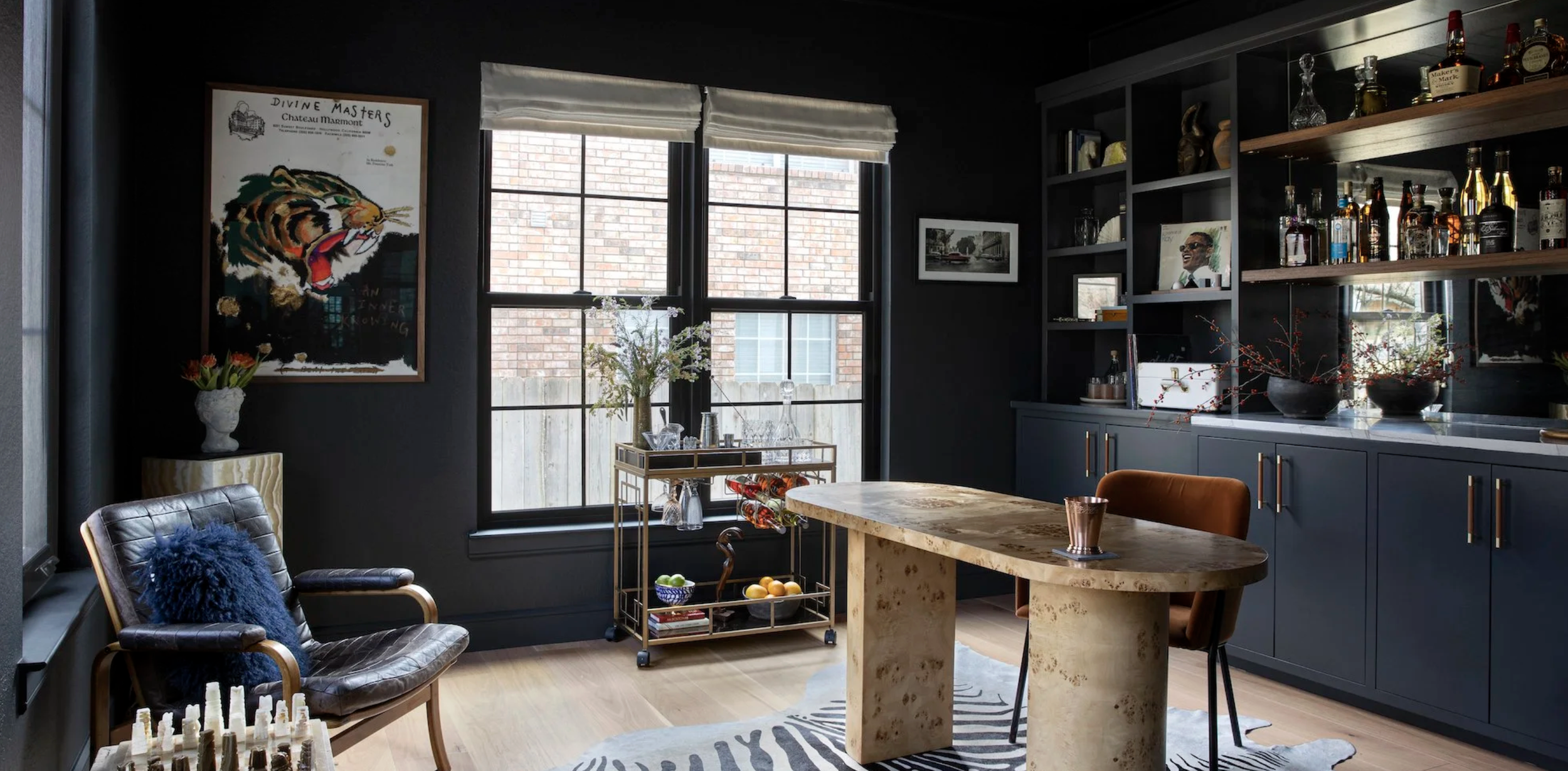
The Moody Office-Bar Hybrid
We began and ended in her moody office—painted a deep green-black. It doubles as her husband’s mixology space. Mirrors line the back of the bar shelving, reflecting light off glass bottles.
During the day, it’s a focused workspace. At 5:00 PM, it shifts energy and becomes a place to unwind.
Christina shared something fascinating: when her children enter this room, their energy changes. The color and mood signal calm. Intention. Presence.
And that’s the power of design.
Different Aesthetic, Same Philosophy
What this conversation reminded me of is that slow style doesn’t look one particular way. It isn’t about maximalism or minimalism. It’s about meaning.
Christina’s spaces may be more restrained than mine—but they are layered with:
Art that tells a story
Antiques with patina
Natural materials
Thoughtful function
Emotional resonance
When your home reflects your life—your travels, your family, your history—it becomes timeless.
And that’s what we’re always aiming for.
If there’s one thing this episode makes clear, it’s that slow style isn’t about achieving a certain “look”—it’s about creating rooms that feel deeply aligned with the way you live. Christina’s work is proof that restraint can still be rich, that modern can still feel warm, and that antiques and patina belong just as comfortably in contemporary spaces as they do in traditional ones. When we choose pieces with meaning, honor the history of our homes, and design around real life—kids, guests, rituals and all—we create spaces that don’t just photograph beautifully, but truly support us. And that, to me, is the heart of thoughtful design.
Until Next Time
-Zandra
Photography Provided By Christina Cruz