Old Bones + Modern Soul: How Jo Berryman Honors History with Bold, Irreverent Choices

In this episode of the Designers at Home series, I take you inside the home of designer Jo Berryman, a space that, to me, perfectly embodies what it means to honor both history and personal expression. As we move through her home together, I’m struck by how effortlessly she blends old and new, preserving original architectural details while layering in sculptural, modern elements and deeply personal touches. What I love most is how grounded her approach is in nature; nothing feels overly forced or decorated for decoration’s sake. Instead, there’s this beautiful sense of rhythm, of organic shapes, of materials aging and evolving over time. It’s a reminder that our homes don’t need to be perfect or finished—they just need to feel considered, alive, and reflective of who we are.
KEY TAKEAWAYS
A Home That Holds Its History and Lets It Breathe
There’s something especially intimate about being invited into someone’s home, and in this week’s episode, I had the privilege of stepping inside designer Jo Berryman’s house just outside of London. What unfolds is more than a tour—it’s a masterclass in how to live with beauty, history, and individuality all at once.
Jo’s home isn’t about perfection. It’s about presence. It’s about honoring what was there before while confidently layering in what feels true now. And as you’ll see, every corner offers something to learn from.
The Kitchen: Where Function Becomes Sculpture
We begin in the kitchen, but not the kind you expect.
Originally a small, purely utilitarian Victorian space, Jo has completely reimagined it while still preserving its story. What struck me immediately was how she kept fragments of the original structure—what she calls “window skeletons”—visible within the new addition. Former exterior walls now act as interior partitions, creating this subtle sense of movement and history within the space.
The details here are extraordinary. A marble backsplash rises behind the range, but instead of ending in a straight line, it curves softly—almost like a wave—echoing the rolling hills just beyond the windows. There are no upper cabinets interrupting the view, just this sculptural moment that feels both grounded and fluid.
Above the range, a custom copper hood, Bauhaus-inspired and fabricated with a local metalworker, turns an otherwise industrial necessity into a focal point. Flanked by alabaster lights, it feels almost like a cathedral to cooking.
And then there’s the cabinetry. Finished in a rich, molded brass designed to mimic the texture of charred wood (inspired by the Japanese technique of shou sugi ban), it gives the entire room this warm, golden glow—like golden hour, all day long.
Suspended above the island is a dried floral orb that’s been hanging for years, quietly evolving over time. It’s imperfect, organic, and completely at home here.
Designing with Nature, Not Against It
As we move through the space, a theme becomes unmistakable: Jo is constantly referencing nature.
Not in a literal, overly styled way but in how she thinks about form, texture, and time.
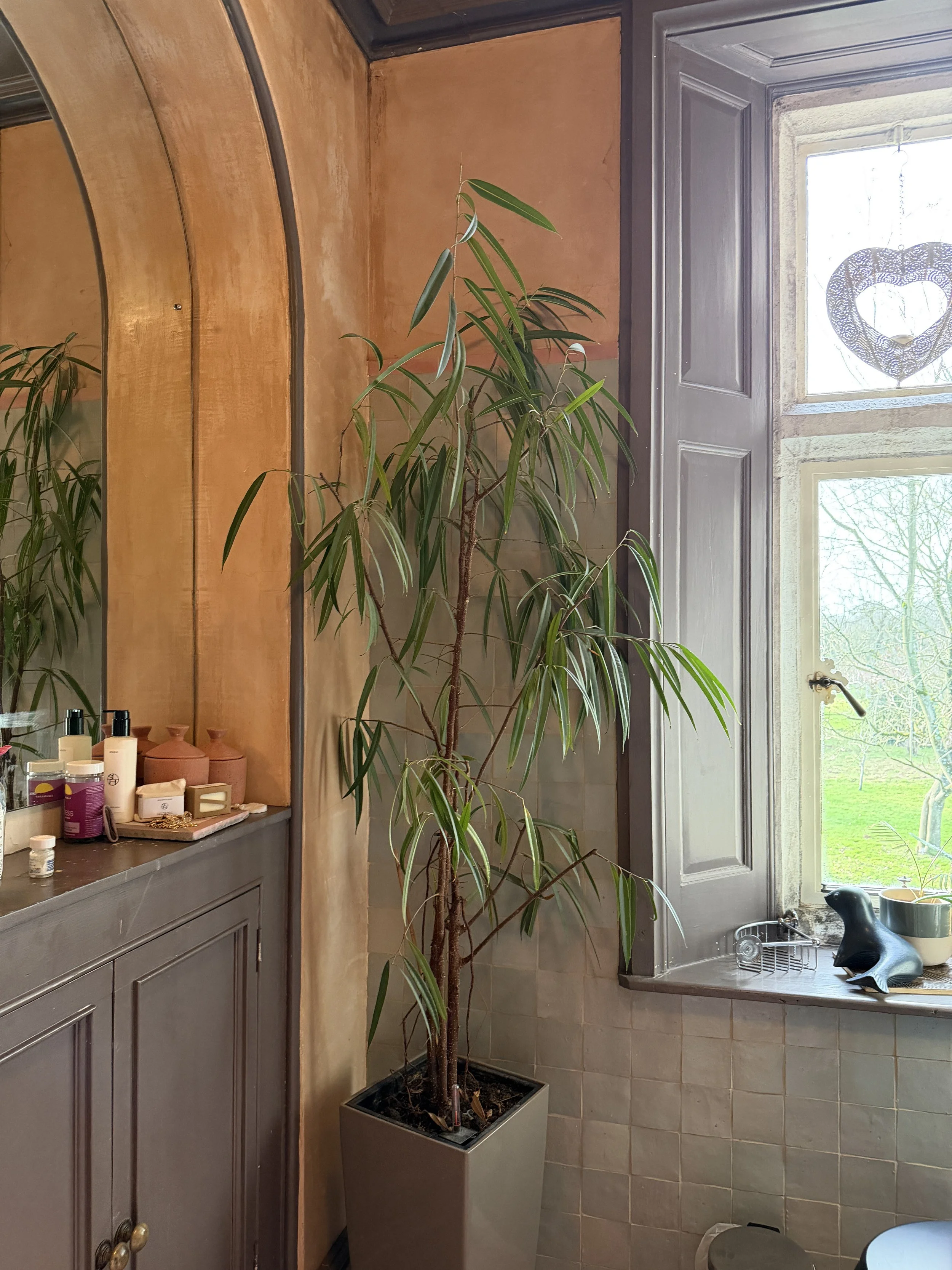
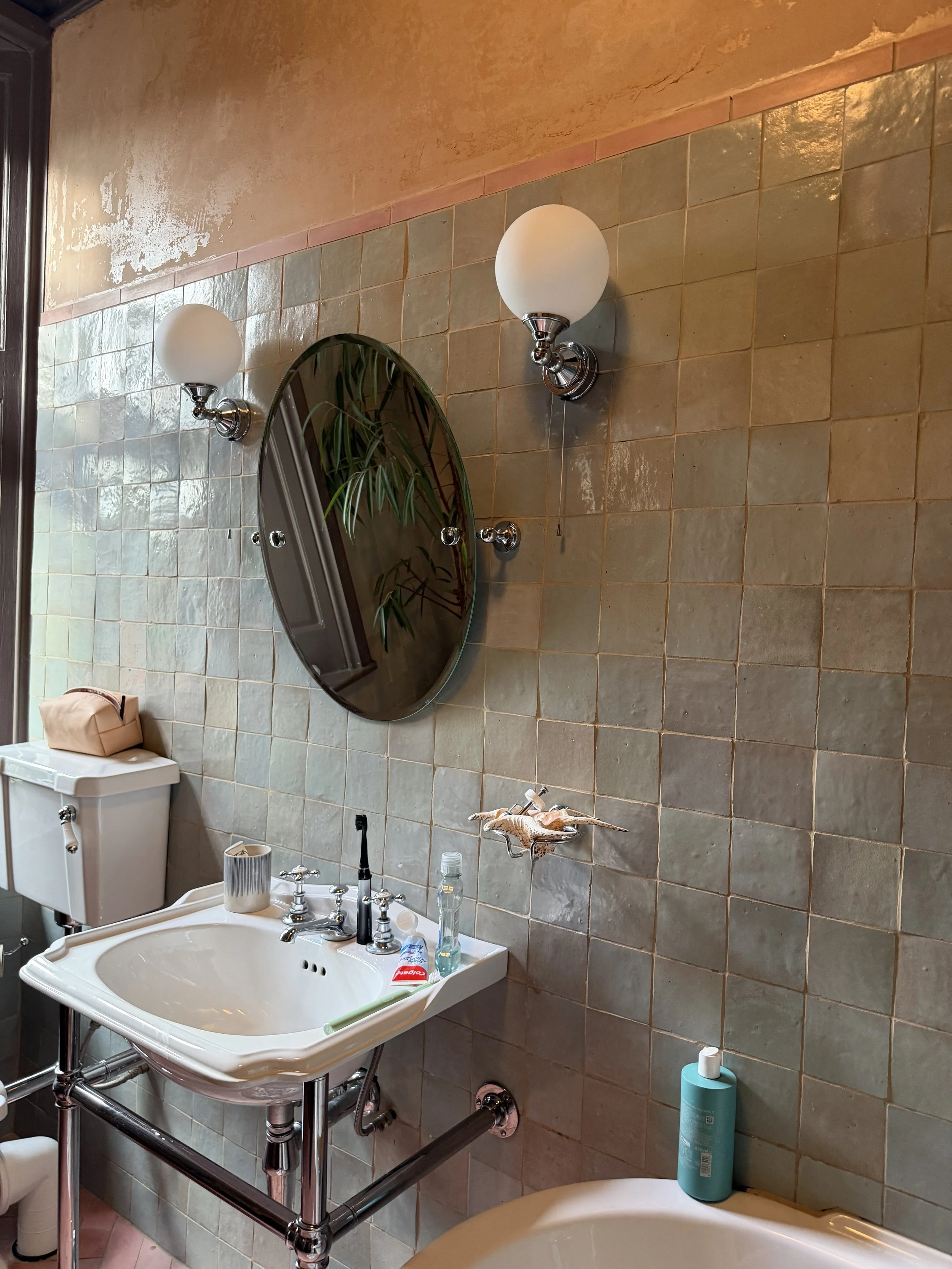
She talks about the beauty of decay. About how a leaf in decomposition or the discoloration in stone can be just as inspiring as something new. You see it in the mix of materials, brick, limestone, and bath stone all layered together without feeling forced.
Even the shapes throughout the kitchen soften what could have been a rigid space. Curves, irregular edges, organic forms—they counterbalance the inherent straight lines of cabinetry and appliances.
It’s a reminder that when we look to nature, we loosen our grip on perfection.
The Dining Area: Industrial Meets Ethereal
In the dining space, a chain mail chandelier floats above the table… yes, chain mail.
It sounds heavy, but in reality, it creates this incredibly delicate diffusion of light. Jo describes it as “architectural jewelry,” and that feels exactly right. There’s a tension here between industrial materials and softness, between structure and movement.
And that tension is what makes it interesting.
The Entryway: Honoring the Bones
The entry hall is where the home’s history really announces itself.
Original details remain intact—the coved ceiling with its painted fretwork in mint green and brick red, the tile floors with their floral border, the pitch pine paneling that Jo painstakingly stripped back to reveal its natural grain.
What I love is that she didn’t try to “perfect” any of it. You still see remnants of old paint, subtle imperfections, traces of time. It feels warm, grounded, and deeply respectful of the home’s origins.
To balance that, she introduced modern lighting—simple orb fixtures that seem to float beneath the ornate ceiling, never competing, just enhancing.
The Living Room: Playing with Energy and Restraint
This room is a study in contrast and confidence.
On one side, a bold Pierre Frey wallpaper explodes across the walls like ink blots, energetic and expressive. Paired with mid-century sofas and layered textiles, it creates a space that feels alive, almost electric.
And yet, it doesn’t overwhelm.
Across the room, a quieter seating area offers a completely different mood—anchored by a geometric emerald rug and a modular circular sofa Jo calls her “circle of trust.” The palette is more restrained, the shapes more enveloping, creating an intimate counterbalance to the vibrancy on the other side.
And then there’s the ceiling.
What began as an attempt to remove discolored plaster turned into an unexpected discovery—markings left behind by the original craftsmen. Instead of covering it back up, Jo left it exposed. A little wabi-sabi moment, honoring the hands that came before.
A Space for Living: The Family Room
The family room is exactly that, a space meant to be lived in.
Painted in a bold, womb-like red (Farrow & Ball’s Charlotte’s Locks), it holds warmth, energy, and memory; this is even where one of her children was born. The color acts almost like a neutral backdrop for an eclectic mix of artwork.
Roman shades made from a woven textile add softness, while playful elements like a swing remind you that this room is meant for movement, for family, for life happening in real time.
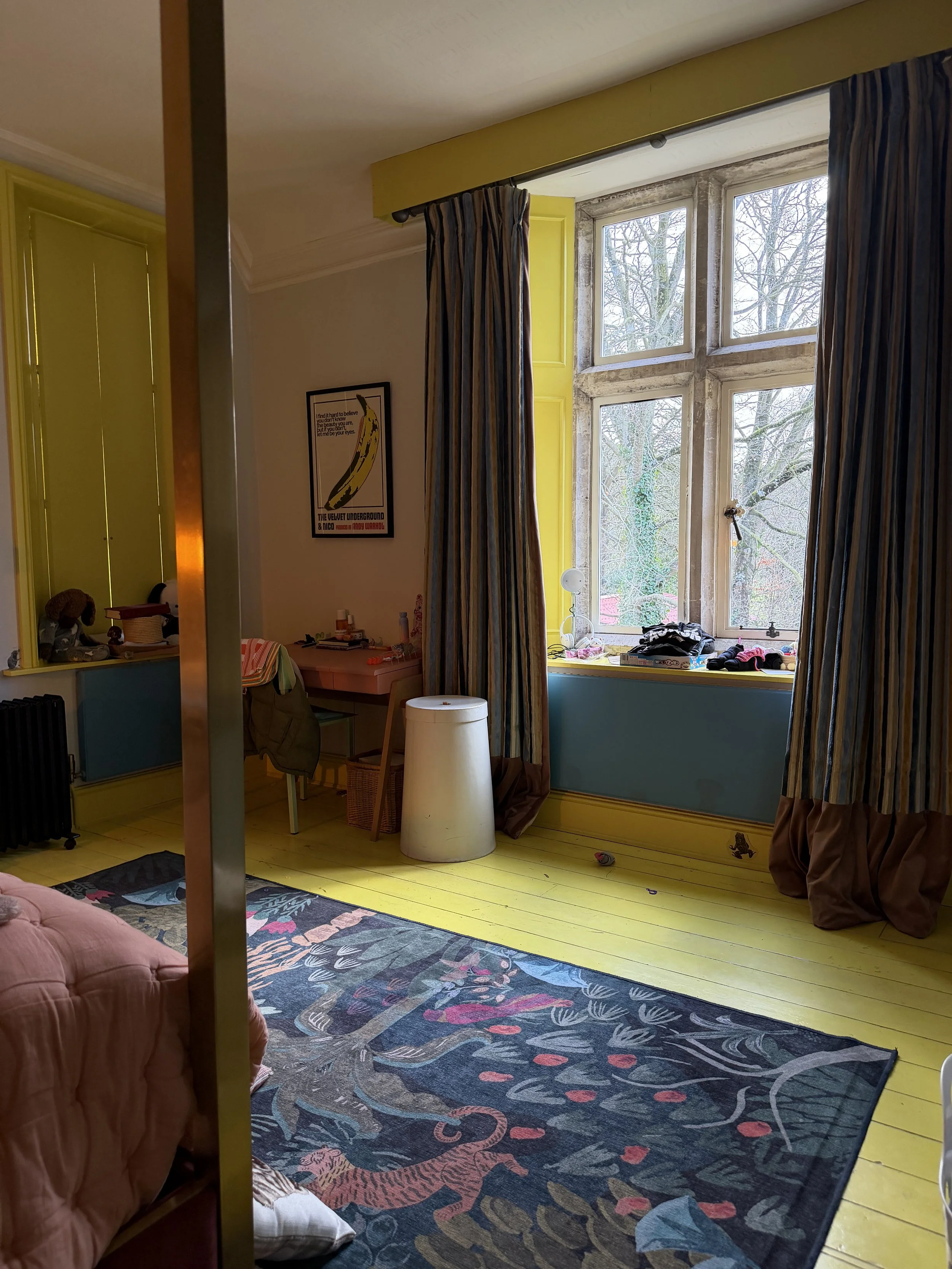
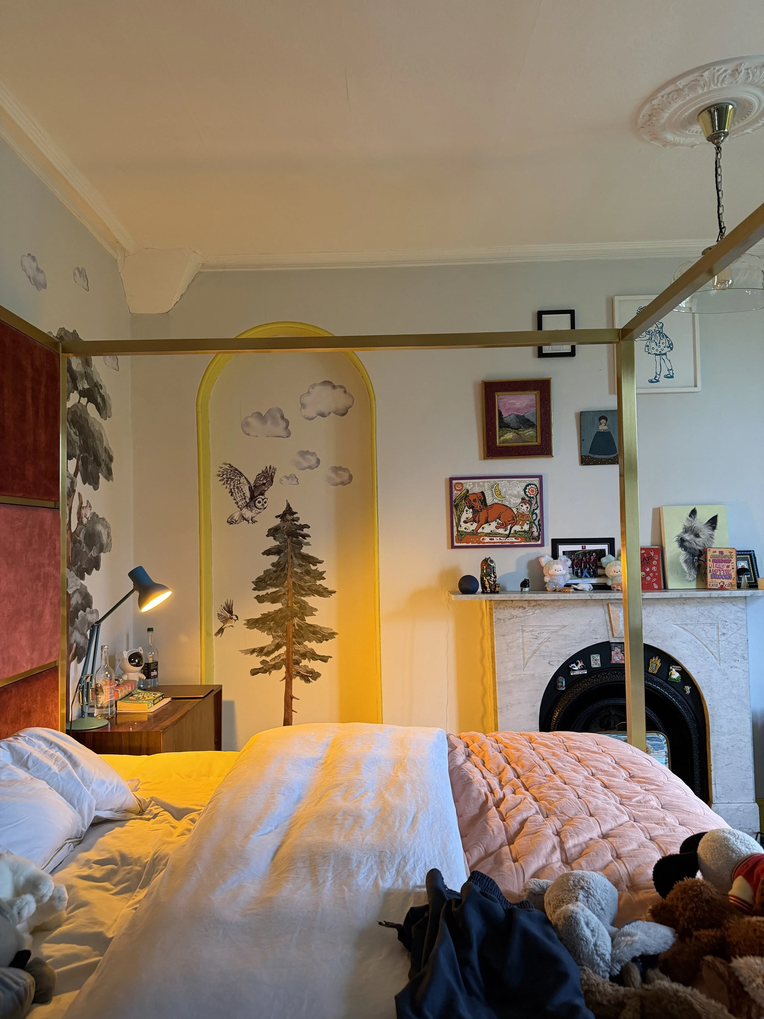
Upstairs: Intimacy Over Excess
One of the most refreshing aspects of this home is the scale of the bedrooms.
While the main living spaces are expansive, the bedrooms are intentionally modest. Jo doesn’t see the need for large, sprawling sleeping quarters—and I couldn’t agree more.
Her bedroom is layered but restrained. A wide, custom headboard upholstered in a Pierre Frey fabric anchors the space, while vintage textiles and a Berber rug bring in warmth and depth.
The palette leans tonal—ochre, tobacco, soft neutrals—but is punctuated with unexpected hits of color, like mid-century orange lamps that keep the room from feeling too sweet.
It’s calm, but not boring. Thoughtful, but not overdone.
What This Home Teaches Us
If there’s one thing this home makes clear, it’s that good design isn’t about rules.
It’s about paying attention.
To the architecture.
To the materials.
To the way light moves through a space.
To what feels meaningful to you.
Jo’s home is layered with intention, but never feels forced. It evolves. It honors the past while making space for the present. And most importantly, it feels lived in—in the best possible way.
And that, to me, is always the goal.
Until Next Time
-Zandra
Links Mentioned In The Episode
Jo’s Website
Jo’s Book